Agile coaching
From problem to prototype in 1 week: how to make rapid progress with design sprints
01 May 2024 • 6 min read

Time. It’s a luxury in this uncertain, fast-moving market - and one not many teams can afford. Delivering on the day-to-day (which inevitably means ‘doing more with less’ in an economy of stretched budgets) means there’s little opportunity to step back, assess challenges with fresh eyes and work on creative solutions.
We can’t gift you the commodity of time, but we can help you squeeze the best solutions out of the time you do have, with a rapid design sprint. All you’ll need is:
• One week - 5 business days
• One challenge to solve
• One or more enthusiastic teams. The ideal sprint group is 5-7 people, so split up if your group allows. If not, more people in one team means more resources for building out your prototype; win/win.
• Willing users to test and feed back on your prototypes
By the end of the week, you’ll have at least one great prototype validated by user feedback. No brainer, right? So let’s dive into what that week looks like.
How to host a one week design sprint
Monday session 1: Research and define your challenge
Start at the beginning, with the problem you’re trying to solve. Is it specific to your business and product (ie. your long-winded onboarding process is driving a high customer drop-off rate), or broader; a problem that challenges your entire market (like consumers are struggling to keep track of their spending and budgets in these uncertain times)? Review any data you have to validate the problem and visualise its scale. Put yourself in the user’s shoes by conducting interviews and market research, and collaborate with stakeholders to gather diverse perspectives.
Once your teams have gathered their intel, facilitate a discussion to consolidate findings and define the core challenge. What are your user pain points, and what are their aspirations? Use this insight to create a really succinct problem statement. That’s what you’ll be working to solve this week.
Monday session 2: Solution ideation
Time to get those creative juices flowing! Before diving in, clarify any technical or budget constraints you’re working with, and specific user requirements to keep front of mind. Remember - there’s no such thing as a bad idea and the team should be encouraged to think outside the box without judgement.
Kick off with lightning demos to explore what’s already out there. Be sure to broaden your exploration beyond your target industry; if you’re trying to do something new, it may not exist yet in your market. Once the team’s cogs are turning, dive into individual “4-part sketching” - a series of:
• Note-taking: Zoning in on the challenge, users, goal and inspiration
• Ideas: Sketching a few ideas based on your notes, exploring the crucial elements and how a user might interact
• Crazy eights: No time to overthink - draw one solution per minute for eight minutes and see where your instincts take you.
• 3-step sketch: Bringing three key steps of your idea to life through sketch/collage.
Be sure to keep your worked up concepts anonymous to avoid any bias in day two’s voting process. Bring all ideas together on a physical or virtual board, ready for Tuesday.
Tuesday session 1 - Vote on a solution to take forward
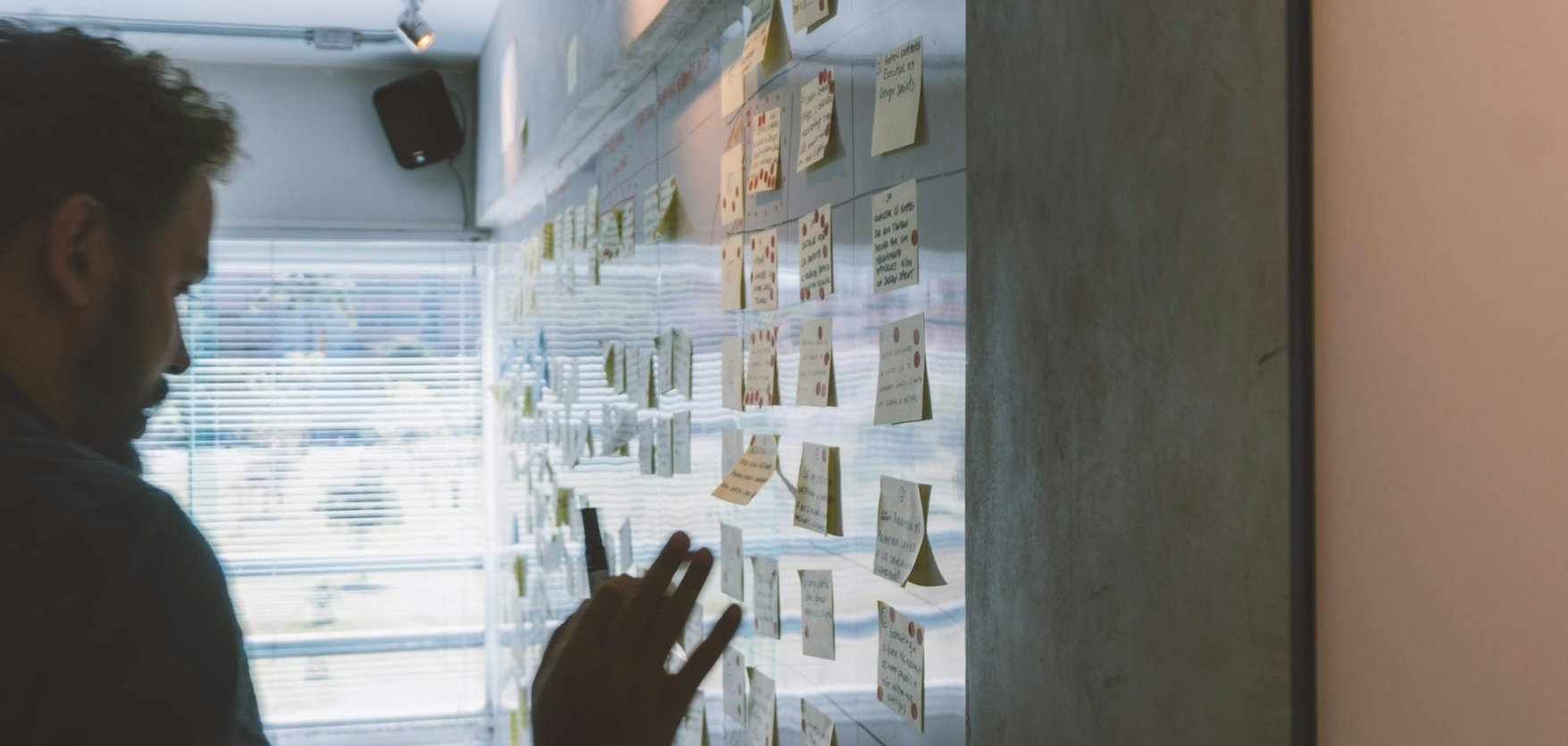
To narrow down and prioritise the most promising ideas, give each team member a set number of votes (e.g. dots or points) to allocate to their favourites.
Based on the results - you’ll likely see some clear heat maps - facilitate a discussion to select the top ideas to take forward. Elect a final decision-maker who can direct the team in the event of decision-paralysis. Be sure to consider the feasibility, impact and alignment with user needs when settling on your final choice as a team.
Tuesday session 2 - Storyboarding
This is where the real fun begins! It’s time to step into your user’s shoes and shape their journey and interactions with your new problem-solving product.

Customer journey mapping example for financial services product
Define your user and their use cases
Set the stage by reviewing your main user persona and the problem or need they’re aiming to address using your product.
Sketch user actions and product responses
Begin your storyboarding by sketching the initial state of your user and product. Illustrate your user’s actions and how your product responds, using frames to depict the flow of the journey. Highlight how key features are presented to the user and how these contribute to solving their problem. Convey the user’s emotions and reactions at different stages, to understand the impact of your design.
Resolution and user satisfaction
Conclude your storyboard with a happy ending. How has your product successfully addressed your user’s initial problem, and what positive impact has it had?
Storyboarding example - design sprint for financial services product
Wednesday and Thursday: Prototyping
The meatiest part of the week; collaborating to turn your storyboards into engaging prototypes. Bear in mind, the key at this stage is to work fast and iterate quickly, prioritising the user flow and experience over aesthetics. Decide first off if you’re going to go high or low fidelity - low being cheap, fast, disposable paper and post-its, high being digital, time-intensive prototypes built on a platform like Figma. Both have their pros and cons and your choice will depend on the skills and resources you have available.
• Together, review your storyboard and ensure everyone has a clear understanding of the user journey, key features and problem you’re working to solve.
• Define the scope of your prototype - which features, user flows and interactions are the most critical to communicate and test your solution?
• Get sketching ideas as a team, and then branch off into pairs with assigned screens, to develop the key elements of your wireframes.
• Connect your wireframes to create a basic user flow, and simulate the user’s journey through the product.
• Gather the team to review the process mid-way. Identify the areas that need improvement or clarification.
Once you’re happy your designs have incorporated all internal feedback, add design elements like colours and images to enhance the appeal of your prototype. Try to ensure consistency in design across your screens.


Prototype examples building a savings app
Friday: Testing with real users
Testing with the users you built for is where the real value comes to life. Create a plan for how users will interact with your prototype and outline the specific scenarios they’ll be asked to complete.
Gather feedback on the usability, intuitiveness and overall user experience, and use this feedback to refine, iterate, and decide a route forward.
Gather the team for a final review of your prototype and user feedback. Document key learnings, insights, and decisions made during the prototyping process - this will all serve as key insight for the next stages of development.
Facilitating your own rapid design sprint
And there you have it - from problem to prototype in just a week. This is a really rewarding challenge for teams and a really effective way to make progress quickly. Solving your user problems fast = happy customers, and products that get there before your competitors.
We kick off lots of our client work with a rapid design sprint; it’s the perfect way to bond as a new team and make a big impact together, fast. If you’d like help getting to the bottom of your challenges quickly, learn more about our Experience Design process.


