How a responsive rebuild transformed equity release for customers at Key

Key

New website_Key hero_large
The Client

About Key

Key’s ambition is to offer independent, expert, and award-winning advice on retirement finance. To date, Key (previously Key Retirement Group) has helped more than 1 million people decide if equity release is right for them.

Key needed to rethink and revitalise out-of-date digital platforms, starting with their website.

A dedicated team of ANDis set up shop in Key’s offices. Together, we embarked on a two-week Discovery and sprint planning phase to better understand business and user outcomes. This was swiftly followed by seven lean build sprints and the first release of a brand new site.

The challenge

A smarter online hub

Key had originally built their website on WordPress. However, after a period of evaluation, Key identified that to improve processes, automation and ease-of-use, the site would need to migrate to an alternative CMS

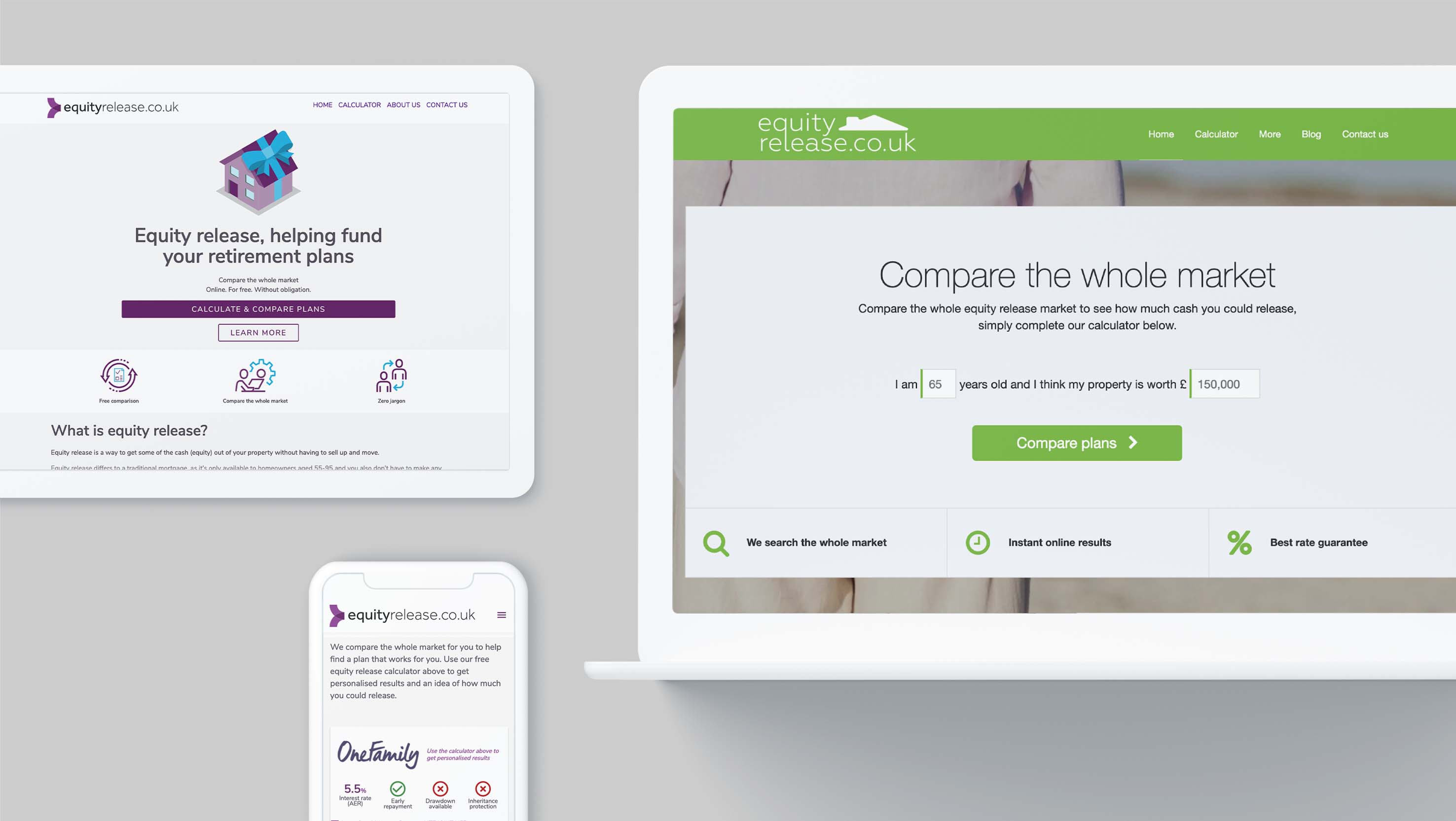
In this case, the new CMS chosen was Kentico. As part of this move, we worked with Key to build a new templated site with new imagery and improved branding that could be easily managed by internal teams.

Another core component of this new digital hub was an equity release calculator. Although this useful tool did encourage conversions on the old site, the consensus was that it could be optimised to drive more. So we set to work rebuilding the calculator from the ground up.

key case study
The Solution

Defining the right architecture

To maximise reuse, and ensure the solution would be easy for in-house teams to maintain, we made the decision for the core architecture of the new site on Kentico to mirror Key’s existing estate

The target stack was Azure-based, using ASP.NET, Azure Functions, Kentico, and Microsoft Dynamics. All documentation was stored in Confluence, and the backlog and development was managed in Azure DevOps.

To embed a rapid release cadence and ensure quality, a comprehensive test strategy was essential. To de-risk the release cadence, automated testing was used for:

  • Unit testing
  • End-to-end/browser testing
  • Accessibility testing
  • Performance testing

Impact

Key user experience metrics saw improvement across Key's website

  • Visitor engagement +30 Seconds avg. user time on site
  • Goals Achieved 100% Increase in website conversions
  • Bounce rate 29% Reduction from 40% to 11%
Key outcomes

Improving user experience

AND Digital's work for Key delivered considerable, tangible value for Key and its customers

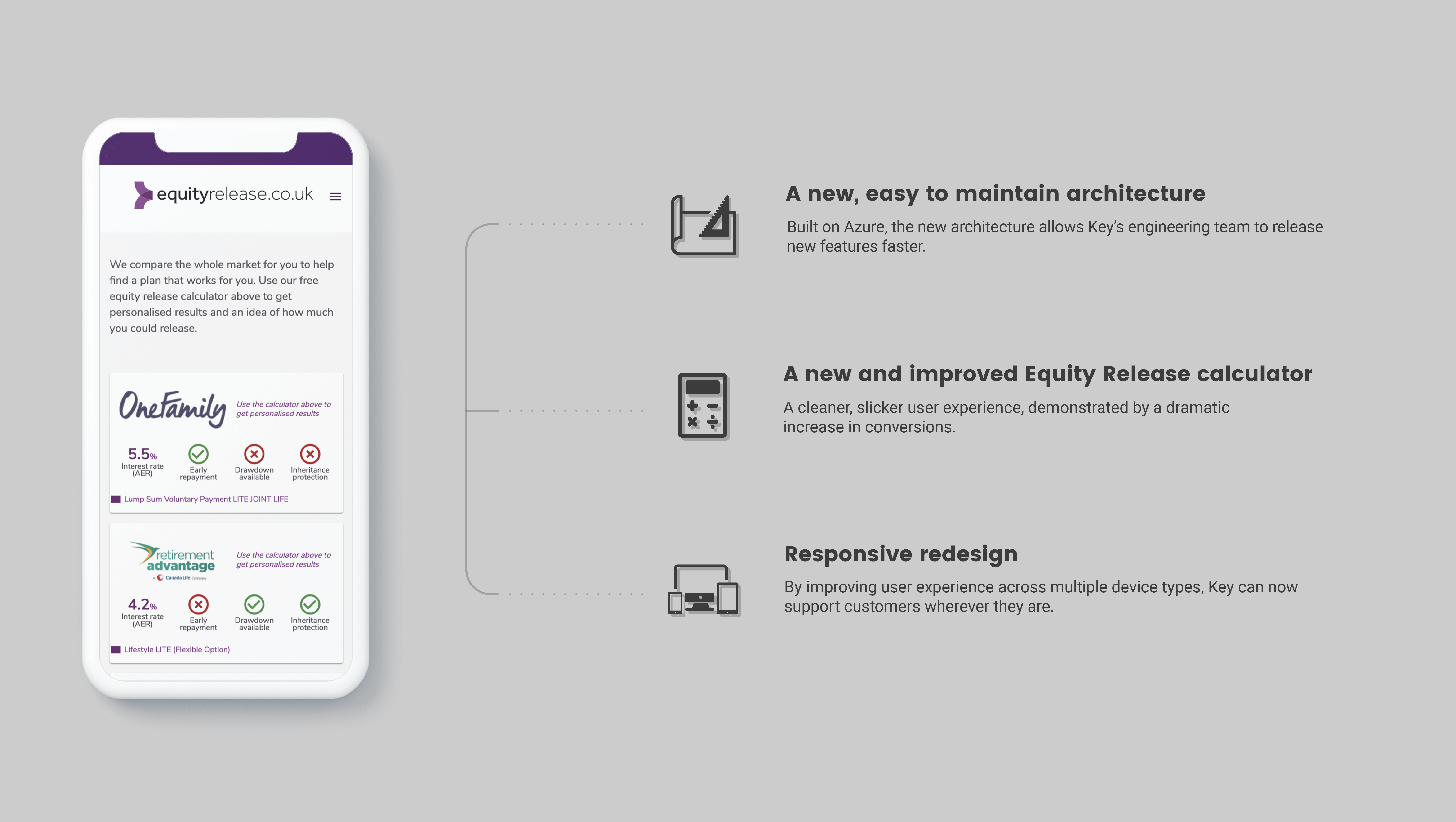
Together, the joint team successfully:

  • Completed a responsive redesign of the website
  • Replatformed the website to Kentico on MS Azure
  • Designed and rebuilt the equity release calculator

As well as the results seen from the rebuild, we also brought other benefits to Key, including introducing an Agile mindset through coaching and practical application.

Following the successful delivery of this project, Key has extended their partnership with AND to rebuild and replatform another product, more2life.

key case study outcomes
Case Studies

Our work

More success digital transformation projects

Talk to us.

Get in touch to discuss all things digital.

Contact us